The Last Brushstroke: How Color Grading Quietly Controls Every Emotion You Feel in a Movie Theater
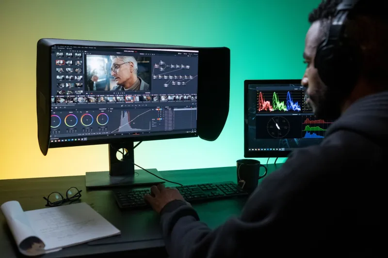
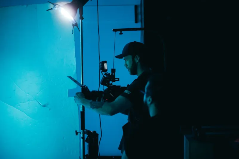
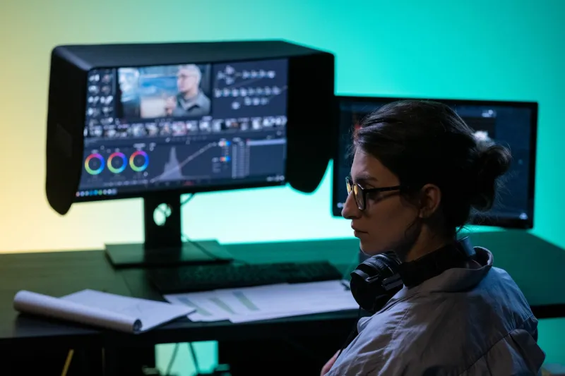
There is a moment in nearly every major American film production — after the last composite has been rendered, after the final CGI creature has been lit and integrated, after the sound mix has been locked — when the entire project passes through one more pair of hands. Those hands belong to a colorist, and what they do in a Digital Intermediate suite over the following days or weeks will either validate or quietly sabotage every creative decision that came before it.
Color grading is not, as it is sometimes casually described, the process of making a film look pretty. It is the discipline of emotional architecture. It is, in the most literal sense, the last brushstroke on a canvas that may have taken three years and hundreds of millions of dollars to construct.
From Photochemical Baths to Digital Pipelines
For most of Hollywood's history, color manipulation was a photochemical process — a matter of controlling exposure, push-processing film stocks, or applying color timing adjustments in the lab. The results were meaningful but limited. A cinematographer could instruct a lab to pull warmth from shadows or push contrast in a print, but the degree of surgical control available today simply did not exist.
The arrival of Digital Intermediate — or DI — technology in the late 1990s changed the calculus entirely. Films such as O Brother, Where Art Thou? (2000) and Pleasantville (1998) demonstrated, in radically different ways, that color could now function as a narrative device rather than a finishing step. The Coen Brothers, working with cinematographer Roger Deakins and colorist Julius Friede on O Brother, famously drained the American South of its greens and yellows, replacing the lush Mississippi landscape with a sun-bleached, sepia-toned dreamscape that made the Depression-era setting feel both mythic and suffocating. No one in a 2000 multiplex consciously registered the color palette. They simply felt it.
That distinction — between conscious perception and emotional registration — is at the heart of what makes color grading one of the most powerful and most underappreciated crafts in contemporary filmmaking.
The VFX Connection: Where Grading Becomes Critical
For visual effects professionals, the relationship with color grading is not merely aesthetic — it is structural. Every composited element, every digitally extended environment, every creature rendered in a VFX pipeline must ultimately survive the colorist's grade. This creates a dependency that is rarely discussed publicly but is understood viscerally by anyone who has watched a beautifully executed CGI shot fall apart because the color pass exposed an inconsistency in the lighting.
When VFX supervisors and colorists fail to communicate early and often, the consequences are visible in the final film. Skin tones that read correctly in isolation suddenly appear synthetic against a graded background. Creatures that were lit meticulously to match on-set reference lose their integration the moment a stylized teal-and-orange grade is applied. The grade, in other words, is not a downstream process that happens to VFX work — it is a fundamental variable that must be accounted for from the earliest stages of production.
The most sophisticated productions understand this. They establish a Look Development process — sometimes called a "show LUT" or a creative color transform — that gives VFX artists a reference point for how the final grade will behave. Work is then developed within that color space from the outset, ensuring that composites, renders, and practical elements are all speaking the same visual language before they ever reach the DI suite.
Landmark Moments in American Cinematic Color
Several American films serve as useful case studies in how color grading can function as a storytelling weapon when wielded with intention.
Se7en (1995), graded by Bob Festa from a bleach-bypass print, established a template for using desaturation and crushed blacks to create a world that felt physically diseased — a city where moral rot had seeped into the light itself. The approach was so influential that it effectively created a visual shorthand for urban dread that persists in American cinema to this day.
The Matrix (1999) deployed a green-tinted palette for its simulated world and a cooler, more neutral tone for the "real" world — a binary color language that audiences decoded instinctively without requiring explanation. The grade was doing narrative work that the screenplay did not need to articulate.
More recently, Mad Max: Fury Road (2015) presented a masterclass in using color to manage the cognitive load of extraordinarily complex action sequences. Colorist Eric Whipp worked with cinematographer John Seale to maintain visual clarity across some of the most densely choreographed practical and digital sequences in contemporary cinema. The warm amber of the desert and the cold blue of the night-chase sequences were not decorative choices — they were structural ones, designed to orient the audience spatially and emotionally at all times.
HDR and the New Frontier
The emergence of High Dynamic Range display technology has introduced both new possibilities and new pressures into the color grading workflow. HDR pipelines — whether Dolby Vision, HDR10, or the increasingly prevalent HDR10+ standard — allow colorists to work with a luminance range that was previously impossible to reproduce in a theatrical or home exhibition context. Highlights can now burn with genuine intensity. Shadows can hold detail that would previously have been crushed to black.
For VFX work, this expanded range is simultaneously liberating and demanding. Renders that were previously acceptable within the constraints of a standard dynamic range can now reveal artifacts, lighting inconsistencies, or compositing seams that were invisible in SDR. The grade, in an HDR pipeline, is more revealing — and therefore more unforgiving.
Colorists working at the highest level of the industry today are not simply technicians applying a look. They are collaborators in the fullest sense, working alongside VFX supervisors, directors of photography, and directors to ensure that the visual language established in pre-production survives intact through the most complex finishing pipeline in the medium's history.
The Invisible Craft
There is a recurring observation among working colorists that their greatest professional achievement is a film in which no one notices their contribution. When grading succeeds, it disappears into the fabric of the film. The audience does not think about color — they think about character, tension, loss, joy. They feel what the filmmakers intended them to feel, guided by a palette they will never consciously identify.
This invisibility is, paradoxically, the highest form of craft. And it is precisely why the discipline deserves far more attention than it typically receives in conversations about visual effects and cinematic production.
At BranitVFX, we understand that the work which reaches an audience is only as strong as the pipeline that supports it — from the first concept sketch to the final color pass. Color grading is not a postscript. It is the signature at the bottom of the frame, the element that tells an audience, at a frequency below conscious thought, exactly how to feel. Getting it right is not optional. It is everything.